Aside from applied projects we are also engaging in artistic and research
projects testing out the limits of what a typeface can be and do.
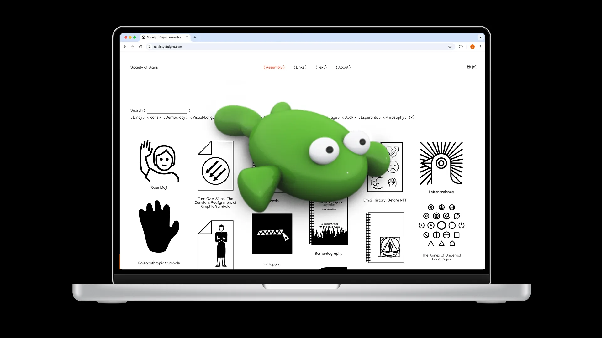
Lebenszeichen (2020)
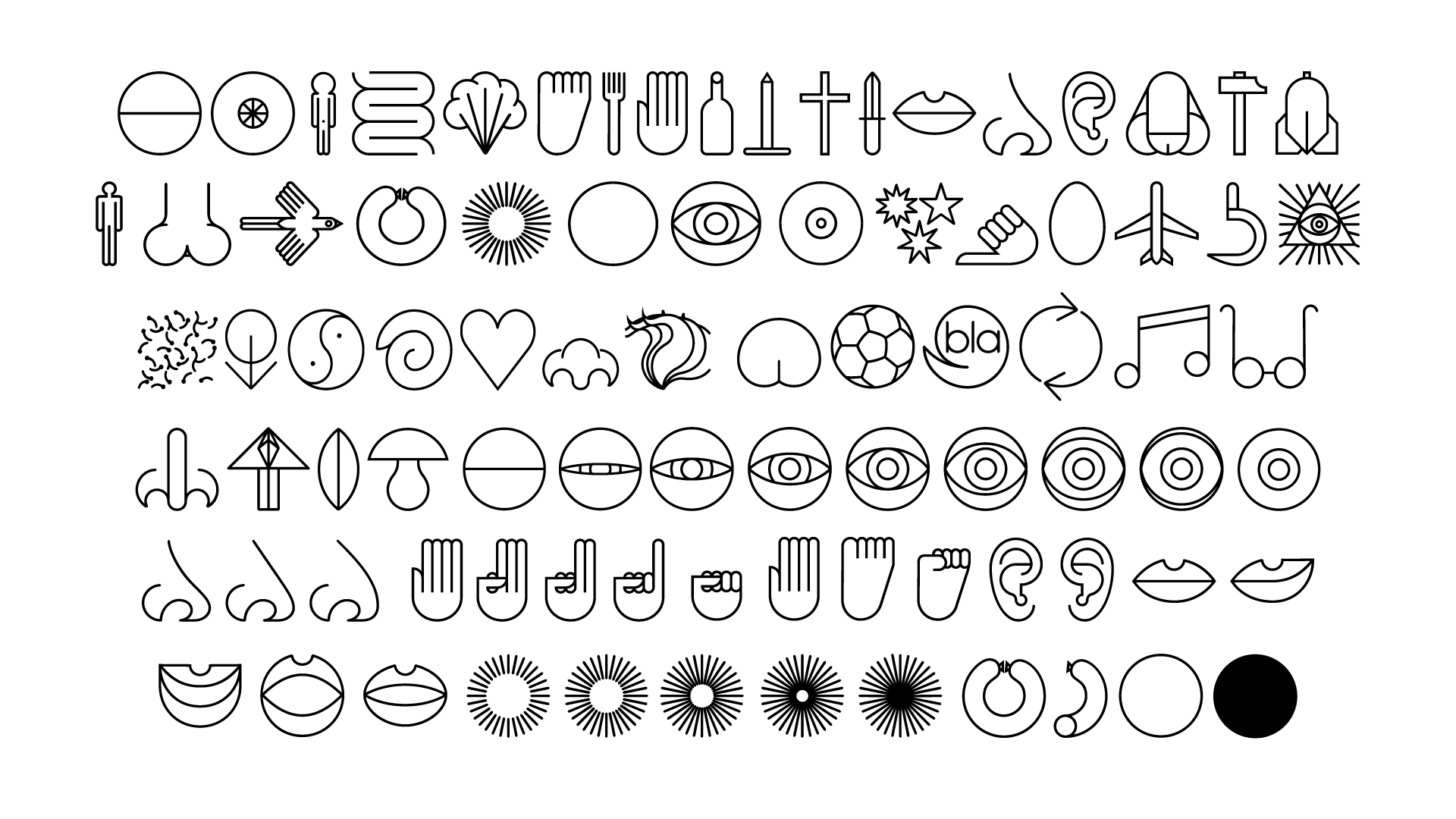
The artist and designer Wolfgang Schmidt developed his own system of
Lebenszeichen (“signs of life”) using the human body as a starting point.
His goal was to “measure the cosmos of experience”. In a timeframe
spanning from 1972 to 1979 he finished 262 out of 893 planned signs. We
combined them into a standard dingbats-like font file. Each upper- and
lowercase letter of the roman alphabet is assigned one sign. Additionally
ligatures are used to display variants of the same sign, as Schmidt had
drawn them. This works by repeatedly typing the same letter. Project
initiated by Maxim Weirich.
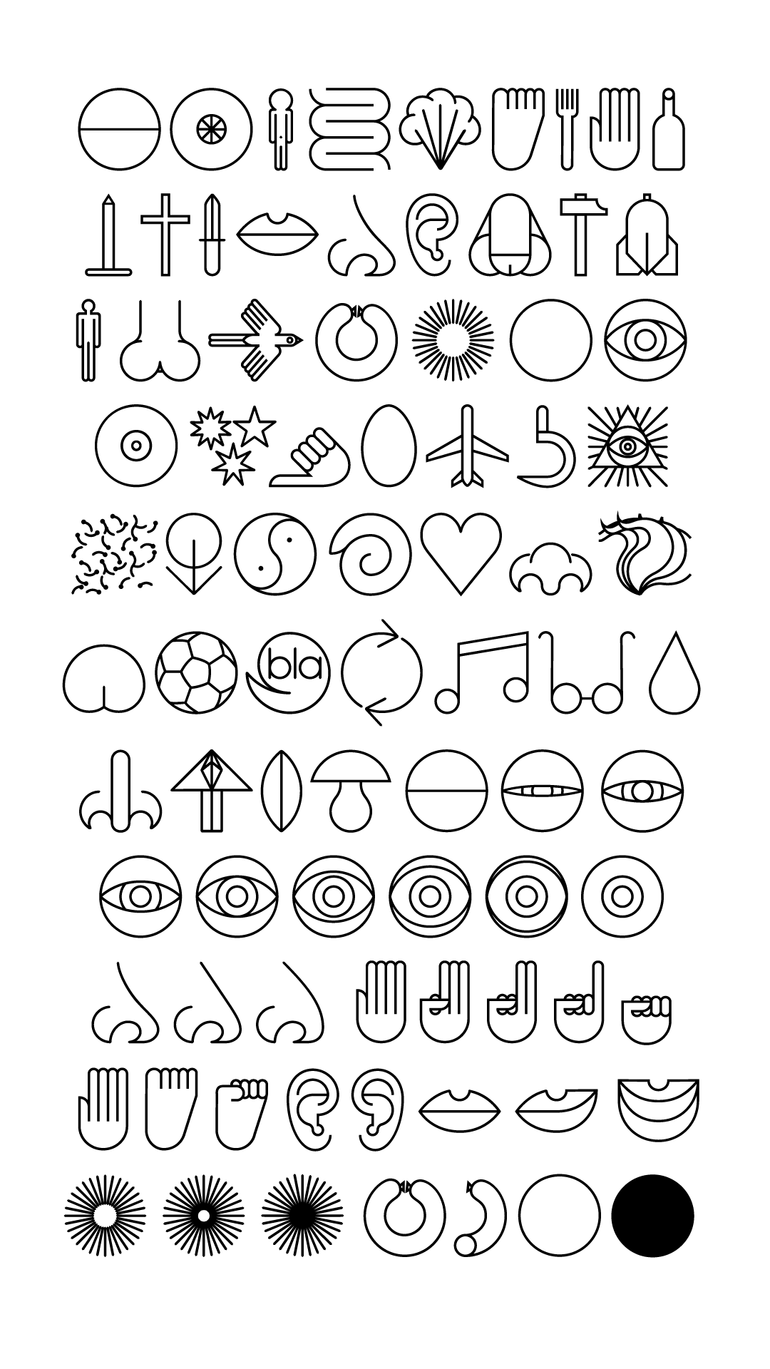
S.S.C.H.T (2021)
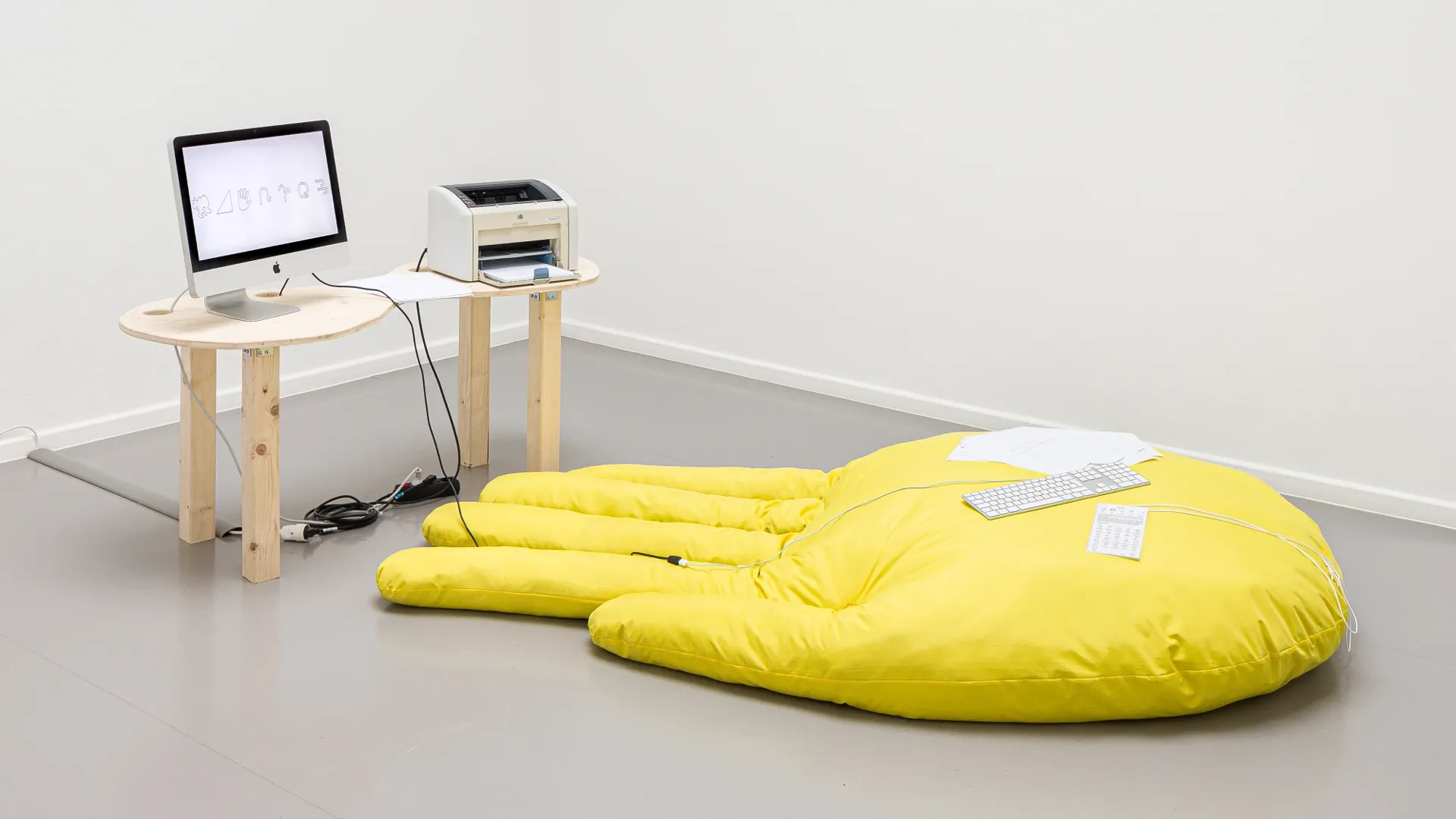
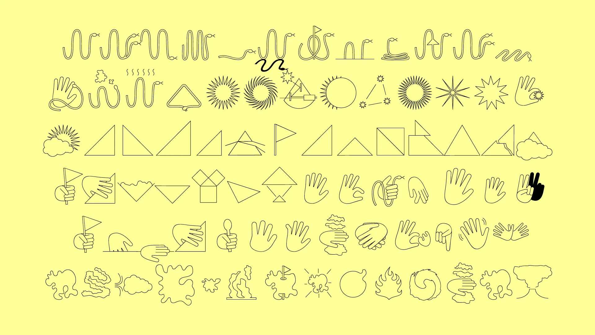
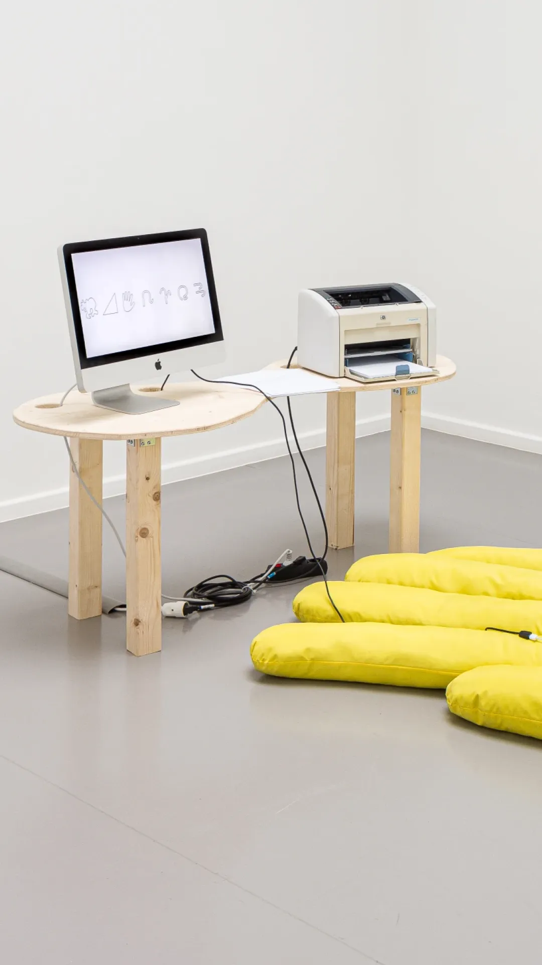
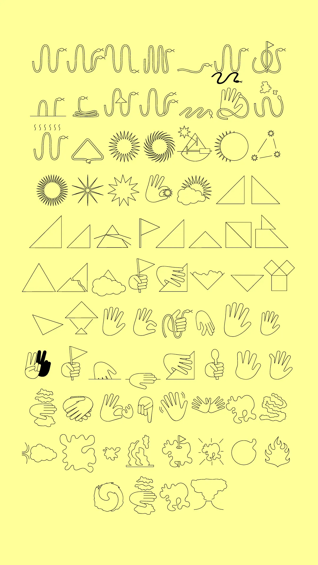
“Snake, sun, cloud, hand, triangle” continues our exploration into symbol
based fonts and especially the possibilities of symbol-based ligatures.
After an initial research, five characters responding to each of the
vowels were chosen. Snake, sun, cloud, hand, triangle. Each of them with a
set of characteristics and unique properties which they follow each time
they interact. The work was first shown as an installation in the
exhibition “Pictograms, Signs of Life emojis : The Society of the Signs”
at Leopold Hoesch Museum in Düren, Germany.
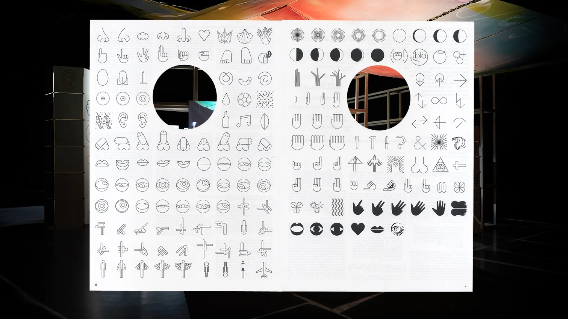
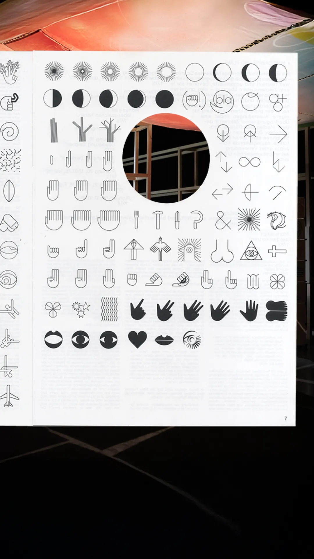
Society of Signs (2023)
The exhibition Pictograms, Signs of Life, Emojis: The Society of Signs was
presented at the Leopold-Hoesch Museum and the Museum für Neue Kunst,
Freiburg in 2020 and 2021. To extend the research initiated by the
exhibition, the website Society of Signs (SOS) was launched. This platform
is dedicated to the ongoing exploration and study of pictography. The
evolving web archive features a diverse collection of works focused on
pictograms and language systems, offering a resource for further
investigation. Concept for the website by Gruppo Due, project initiated by
Maxim Weirich and Edgar Walthert.
Ciao (2018)
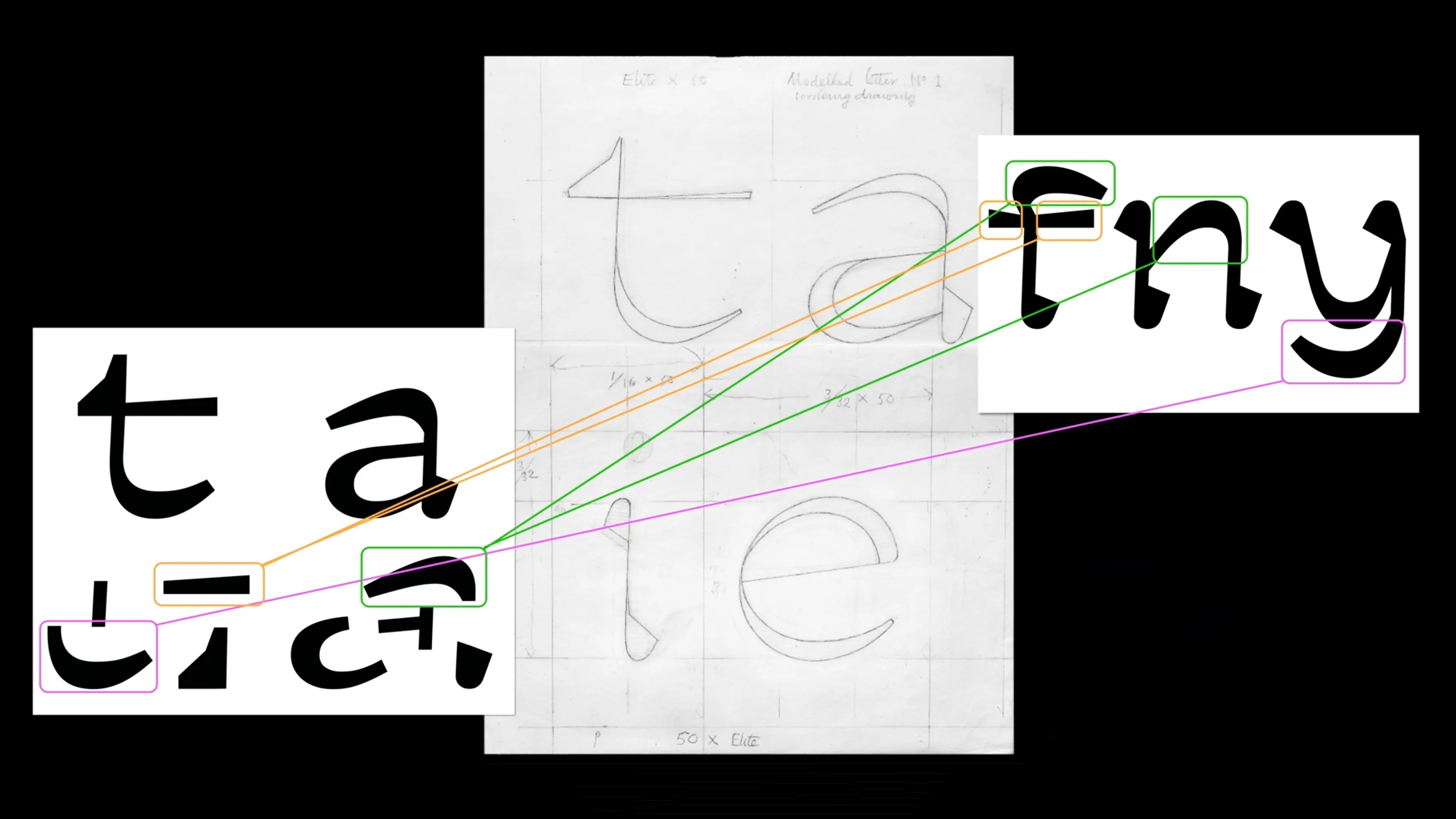
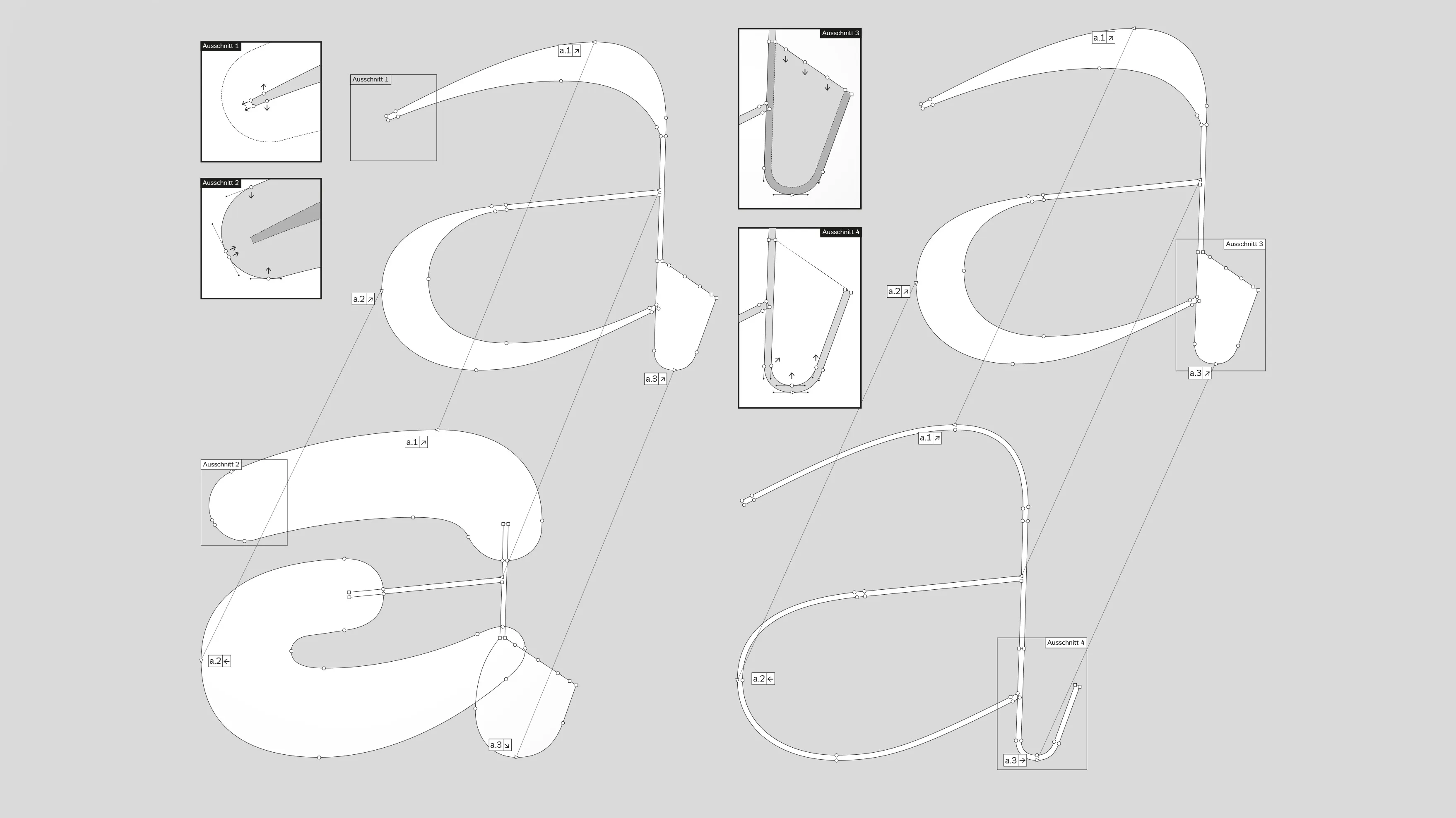
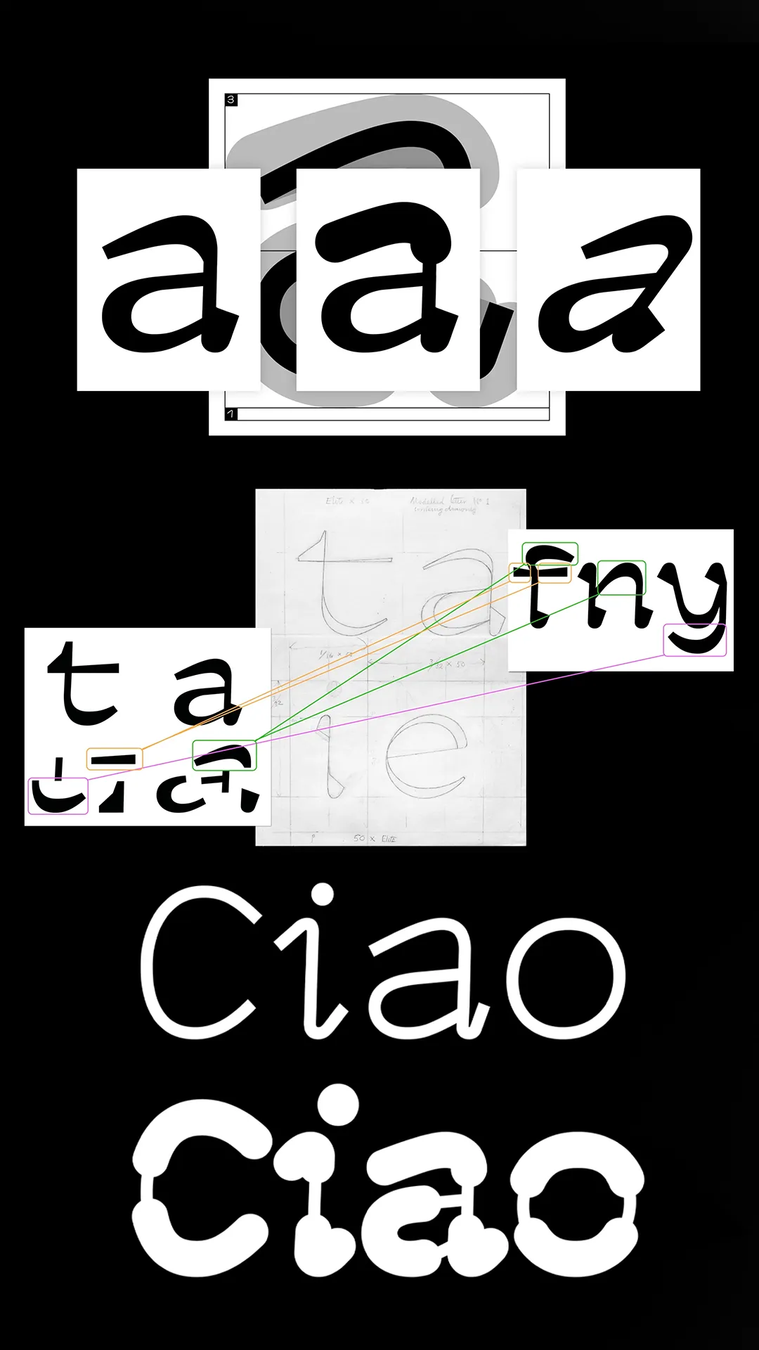
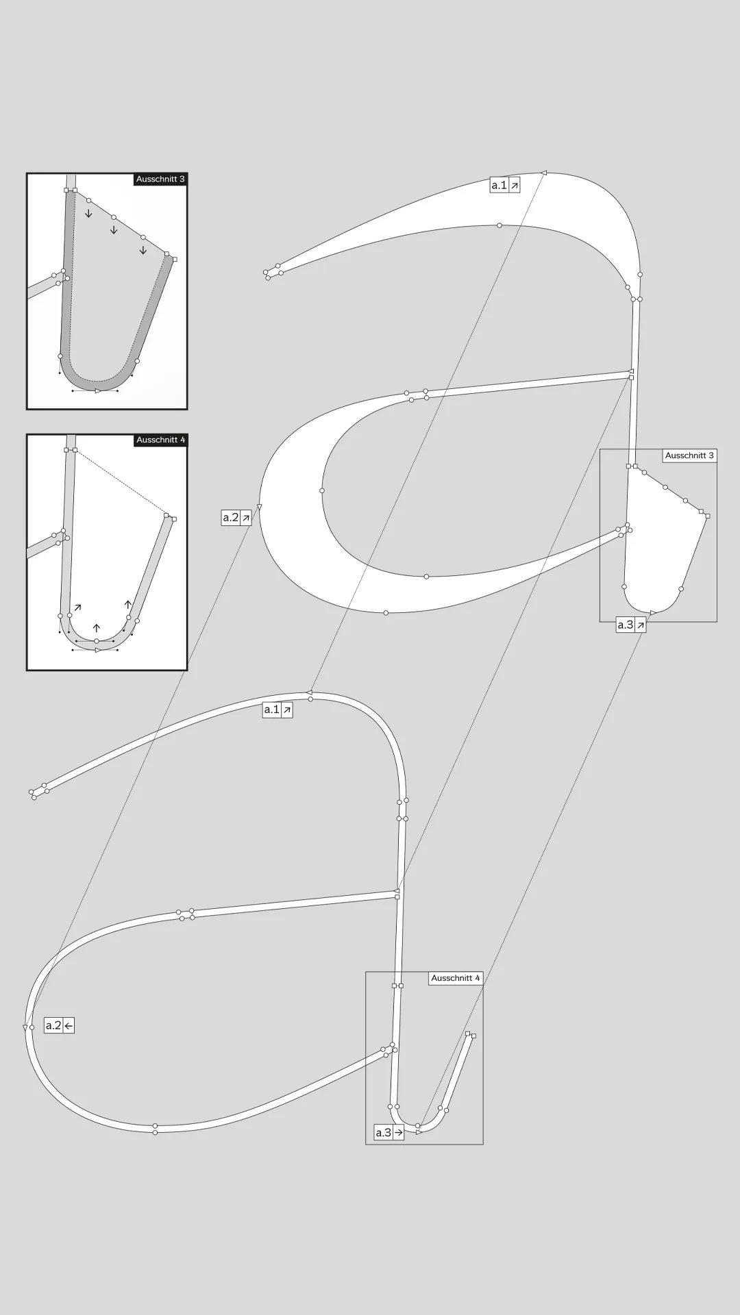
Ciao is a typographic research project developed by Gruppo Due, exploring
the connection between writing, voice, and visual communication. The
project investigates how the physicality of spoken language can be
representedthrough type, creating a typeface that responds to the rhythms
and qualities of verbal expression. Ciao bridges the gap between auditory
Descriptions.rtf and visual language, offering a new perspective on
typographic design. The project was funded by Berner Design Stiftung and Kultur Stadt Bern as part of an ongoing research into typography and
its performative potential